

By THEO BJORNSTAD
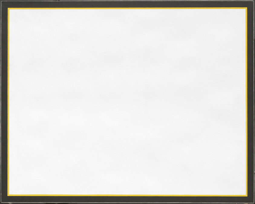
As I walked into Gallery 297, I saw Jo Baer’s Brilliant Yellow #9 and had no idea what to think about it. It looked out of place, even surrounded by pieces just like it. No matter how hard I looked, it kept no secrets. It was then a thought wandered to the forefront of my mind.
“I could make that. It’s just two borders after all. What makes it so special that it gets to hang here, in the same building as something like ‘American Gothic’?” I thought.
This thought isn’t unique to me, or even unique to people not in the artistic space. Many people outright dislike modern art as a movement, and even more simply regard it with confusion, for a variety of reasons, but I think there are some truly incredible pieces in the world of modern art, Jo Baer’s Brilliant Yellow #9 being one of them. Dismissing the whole movement is a mistake.
I want to begin by addressing the fact that when I say modern art–I’m referring to post-modern and contemporary art. While modern art, by definition, technically only encompasses artwork from the 1860s to the 1970s, most people in non-artistic circles refer to the artwork of the recent past (and abstract art) as modern art, so that’s how I’ll refer to it here. I’d also like to make clear that you don’t have to like modern art. Art is subjective, after all. Still, I am going to try to convince you why it might be worth another look.
The problem a lot of people have with modern art is that it sells for ridiculously large amounts of money, despite looking like little effort went into making it. For instance, Comedian by Maurizio Cattelan, which consists of a store-bought banana stuck to a wall with duct tape, sold two editions for $120,000. It makes you wonder what people with $120,000 and more to spare see in a piece of taped fruit. The short answer is money.
Art increases in value over time, even more so if the person who made it has passed on and can’t make any more. It’s also collectible, and it can be donated to museums to be marked off as a tax-deductible donation, which is especially lucrative if the piece of art is “theoretically” worth some absurd amount of money.
This kind of system applies to all art in circulation though, so why is it a reason modern art is cool? Because pieces like Comedian aren’t supposed to be good art. By being so ridiculous, they satirize the over-commercialization of art by making the people buying it look stupid. There’s no reason why you would spend $120,000 on a banana, but rich people will do it anyway. In the case of Comedian especially, the name alone makes it clear what its purpose is: to make a joke out of the people buying it.
Through that commentary on the state of art, I would argue it becomes valuable artistically. That isn’t to say that all, or even most modern art is like Comedian, which is purposefully bad. A great deal of it, especially the pieces that you see in museums, have a surprising degree of care, effort, and skill put into them.
Many people dismiss modern art based on technique claiming that there wasn’t any amount of significant work or skill involved in its creation. This essentially follows the logical path of: “I could make that, so why is it in a museum?”–as I did upon seeing Jo Baer’s “Brilliant Yellow #9.” The painters of the past, such as Van Gogh, Monet, Michelangelo, and Da Vinci seem immediately more skillful in comparison. Their work is deliberate. Every brushstroke is carefully considered and performed especially to elevate the feeling and detail of the painting. Even the best abstract and modern art seems woefully unqualified to compete with that degree of artistic skill.
Take one of modern art’s greatest painters, Mark Rothko. His work seems almost pitiful in comparison. His most acclaimed pieces are sets of two or three thick, bold stripes of varying muted colors, set against what appear to be hastily textured backgrounds. Hardly a match for any acclaimed non-modern artist. That is if you’re looking at them on a screen, which you probably are if you just searched him up to see what his paintings look like.
His paintings are an entirely different experience in person. They are monolithic. In a dimly lit room, surrounded by Rothko’s work, you are swallowed whole, crushed by the weight of the room around you. You become small in comparison to this painting, this titanic thing in front of you occupying your entire field of view.
Rothko’s work hangs in some of the most prestigious galleries and exhibitions in the world, including the Art Institute of Chicago, in the same wing as Jo Baer’s Brilliant Yellow #9. The technique in Rothko’s work is present in the structural aspects of his work. Its simple shapes and colors hide an incredible amount of complexity. Every color present is a cleverly concealed blend of lighter and darker hues. The rough, hazy edges make it hard to determine where the shapes end and the background begins. All in service of creating a sense of truly monumental scale. Rothko’s work is a lot of things, but it isn’t lacking in technique or craft, and the same goes for other great abstract and modern artists. Barnett Newman, Keith Haring, Christopher Wool, all of these artists, and more have their own techniques for creating truly incredible works of art. Stuff that you (probably) wouldn’t be able to make.
That leaves us with the focal point of this article: Jo Baer’s Brilliant Yellow #9. What could a piece only a few paintbrush strokes away from a blank canvas have to offer? Did I ever end up finding anything in the white? The longer I looked at the painting, the more sure I was that I was missing something, that my eyes had missed some speck or corner. There had to be more to this piece. I learned, later, that there never was anything there. But in all honesty, I’m not even sure that matters. I don’t think it matters whether or not I could make it either. I saw a lot of truly incredible art pieces when I visited the Art Institute. They were even running a Van Gogh exhibit that day, and I remember it being good. Fantastic, even. But the piece I remember with the most vivid clarity, the piece I spent the longest looking at, was Jo Baer’s Brilliant Yellow #9. It changed the way I look at paintings. Because of Jo Baer, Because of Brilliant Yellow #9, I take a little bit longer now before I move on to look at the next piece.
Featured image: Jo Baer’s Brilliant Yellow #9
Leave a Reply